How to use this site

If you are here to visit me from a specific class, simply click on the class number above and the posts from that class will be displayed.

To read more of a post simply click on the post title.

thanks!
Showing posts with label 131. Show all posts

Peter Max

Peter Max, excerpts from Graphic Design.com

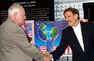
I thought that I would end the semester with an entry about Peter Max. I had the opportunity to meet him during the height of his career at an art gallery show opening. Although I do not remember much about the meeting, I did take home a signed copy of a print that they were featuring at the event.

Here is an entry from the editor of Graphic Design.com about Max;

Peter Max is one of the most public and accessible artists of our era. His appeal is like those of America's most enduring icons, spans all demographics, and has done so for several generations. Max's famous signature style and depicts a joyous, exuberant, sustainable world. Max has been an advocate of ecology and sustainability since the first Earth Day and was moved to create posters for Greenpeace, the Peace Corps, Save the Whales, and many more environmental causes.

NewsweekEven today, when you need a Peter Max image, there's only one place to get one! From Max himself! Many other artists have attempted to emulate Max, (including me,) with not such good results. In fact, at left you see a recent NEWSWEEK magazine cover created specifically by Max for an issue relating to the era.

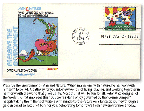
In 1974, Max created the first 10-cent U.S. postage stamp, with the slogan, "Preserve the Environment." He was also the Official Artist for three United Nations Earth summits and created a series of twelve U.N. postage stamps for each of the summits. As official poster artist for more high-profile global events than any other contemporary artist, Max has championed the causes of world peace, ecology, human and animal rights, and space exploration-confirming that he is not only one of America's most famous and prolific living artists, but also one of the most relevant. Max has virtually redefined the role of the artist in American culture.

Peter Max's postage stamp

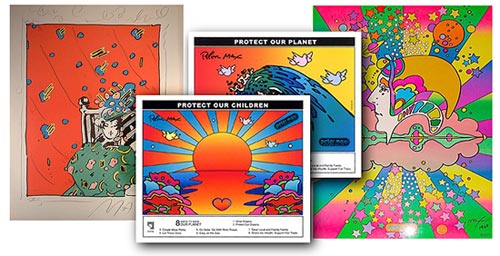
PresentationUnited we StandMax used his work as a means of giving to the victims of the Sept. 11, 2001, terrorist attacks in the Pentagon and New York. After the attacks, he designed six posters to raise money for victims' funds. He presented prints of those six posters to hang in the rebuilt section of the Pentagon. (Read more)

"They cost $150 a piece," Max said, "and $145 of that goes to the victims' funds. So far, the prints have raised "hundreds of thousands of dollars."

I tried to purchase one, but by the time I got there, unfortunately, they were all sold out very quickly.

You can still own an original Peter Max, and support nonprofits at the same time! At the Peter Max web site, you can support The Marine Mammal Conservatory, a non-profit all-volunteer organization, who rely 100 percent on monetary donations, by purchasing any of 5 posters. The proceeds will go towards the rescue and rehabilitation of marine mammals. Proceeds from these six posters will benefit the Marine Mammal Conservatory. See them and purchase them here.

Peter Max art

Newsweek Voices features a nice slideshow of Max's work, along with commentary from the artist himself on each slide. 'We Wanted to Change the World' A history tour of 1968 through the eyes and art of Peter Max, in conjunction with the above mentioned Newsweek cover design. You can also take a little tour of Peter Max work at Laurel Neustadter's "Artists Journey" blog.

Most importantly though, visit Peter himself at his web site PeterMax.com. Even if you weren't around during the '60s and '70s, the lively vibrance of his art transcends all ages and backgrounds. It's just fresh and invigorating! I think you'll like it!

Until next time... keep on drawing!

Fred Showker 
      Fred Showker, Editor/Publisher

For each entry in your blog, write one paragraph describing your selection:

* Describe what it is
Peter Max

* Describe its function
Max is a famous artist who rose to popularity during the 1960's and early 70's for his pop culture poster work. Peter Max Finkelstein was born October 19, 1937 in Germany. His family escaped Germany in 1938 and emigrated to China. The family settled in Israel in 1948. Max attended art school in Paris for 6 months, he then moved to Brooklyn in 1953.In 1956, Max began his formal art training at the Arts Students League in Manhattan, studying anatomy, figure drawing and composition.

* Describe where you saw it
Graphic Design.com
* Discuss the style of the design & typography
Peter Max had a unique style that was a part of the psychedelic movement in graphic design. His work was much imitated in commercial illustration in the late 1960s and early 1970s.
* Discuss the quality of the artwork
His reputation speaks for itself.
* Discuss what attracted you to the piece

I thought it would be nice to end the semester featuring a living artist who I have met.
Read more

Updated Swiss

Read more

Saul Bass

Read more

Great Package Idea!


For each entry in your blog, write one paragraph describing your selection:

* Describe what it is- Newton Running's new titanium shoe package. It is made out od molded paper pulp- like an egg carton, in the shape of a pair of nested shoes. The packaging is light weight, space saving and totally compostable.
* Describe its function- sort of like a shoe box.
* Describe where you saw it- Design Annual 49 of Communication Arts
* Discuss the style of the design & typography- Very environmentally minded, like many of the potential purchasers of the product.
* Discuss the quality of the artwork- There really is no artwork other than the package design. I think this may one of the points of the project. Simplicity.
* Discuss what attracted you to the piece- DUH, it's so darn practical. Makes a lot of sense. Almost makes me forget that I've never heard of the product manufacturer.
Read more

Art Chantry


For each entry in your blog, write one paragraph describing your selection:

* Describe what it is
This is a poster done by Art Chantry from the Art Chantry show in the Parkland Gallery.
* Describe its function
To advertise what appears to be a concert by the Mono Men and the Nomads. (I know..who?)
* Describe where you saw it
Parkland Art Gallery
* Discuss the style of the design & typography
The best way to describe his work would be to say that he does his own thing.
Many of his posters feature type that varies among the letters. It gives the overall poster a billboard poster from the Victorian era look. His designs can be loud to the eye with the colors used and size of objects. This piece differs from the majority of the posters on display in that it is not done on the normal poster medium but, rather on an actual vinyl record. It is also not loud and harsh on the eyes like many of his posters.

* Discuss the quality of the artwork


Well, obviously, the use of a vinyl album to look like a tire- in motion- to actually be a poster. GeNiUs.

* Discuss what attracted you to the piece
Initially I thought "this is art? and " this was created by an award winning artist?"

Then I got up close to it and got excited.
He used a vinyl album! So cool! The wording is done on the actual album


About Art Chantry

Arthur S.W. Chantry was born April 9, 1954 in Seattle, Washington. He is a graphic designer often associated with the posters and album covers he did for bands from the Pacific Northwest, such as Nirvana, Hole and The Sonics. He as also done work in logo design.

Chantry uses a 'low-tech approach' to design that is informed by the history of graphic design. His work has been exhibited at the Rock and Roll Hall of Fame Museum of Modern Art, Seattle Art Museum, the Smithsonian and the Louvre.

Chantry is basically self-taught. He returned to Seattle in the late 1970's, and in the early 80's became the art director of the Rocket, a monthly music magazine. He also emerged as a graphic designer known for quick turnarounds and innovative (and cheap) ideas about production.
Mr. Chantry is probably best known for expanding on the bristling low-tech aesthetic of punk music, in posters and album covers for bands like Nirvana, Hole and the Sonics, as well as lesser-known groups like the Cramps, the Lord High Fixers, Mono Men and Bert. These works reflect an omnivorous talent for the incisive recycling of vintage images, usually with a handmade look that Mr. Chantry calls roughed up.

Among his sources are 60's psychedelic posters, wholesome 50's advertising (including pages from tool catalogs and grocery store circulars) and Monty Python's gloss on Edwardian illustration -- usually presented with a sense of clashing social values. These are underscored by techniques like torn-edge collage, taped images, messy script, punch-printed lettering, startling juxtapositions and endless variations on the possibilities of photographic graininess achieved by repeated photocopying. His gift for language is especially prominent in a poster in his influential ''tool style'' that features a policeman extolling the benefits of condoms: ''250,000 times cheaper than the average child!!''

Basically, Mr. Chantry seems never to have met an image or a technique that he couldn't bend to his own or his client's advantage. If you don't happen to be steeped in the history of graphic design, punk rock or the Seattle underground -- or even if you are -- his gritty inventiveness gives this show the force of revelation.
ROBERTA SMITH New York Times
Read more

Finding Lautrec at Southeby's


For each entry in your blog, write one paragraph describing your selection:

* Describe what it is- Recently, I was going through my mother's things and I found a Southeby's Auction House catelog for a 19th and 20th Century Prints auction that was held in 1994. In the auction there were a number of Lautrec items. The top print was a lithograph printed in color in 1896. It was number 40/100 and published by Gustav Pellet. It was printed on fine woven paper on a full sheet- 20 3/4 X 15 7/8". The value at the time was between $30,000 and 40,000.
The bottom print is entitled "Cycle Michael". It is a lithograph printed in olive, 1896, signed in blue pencil, number 12/200. It measured 35 1/4 by 50 1/8in. The value at the time was between $6,000 and 8,000.
* Describe its function
This auction was from private collections. The auction was conducted by Southeby's in New York.
* Describe where you saw it
The Catelog from the auction.
* Discuss the style of the design & typography
Letrec, in case you missed the lectures and reading, was a famous poster artist from the art nouveau period.
* Discuss the quality of the artwork
Surprisingly, the artwork itself was said to have been in good condition, despite being 100 years old. It was probably well-kept in private collections for some time.
* Discuss what attracted you to the piece
I wanted to showcase the book and I thougt the artist would be easily recognizable to the class.
Read more

Swiss Style Presentation

Read more

Fruit of the Loom Underwear


For each entry in your blog, write one paragraph describing your selection:

* Describe what it is
This is an advertisement that appeared in several magazines that I subscribe to. The top picture is the first thing you see. When you turn the page you are surprised by a pop-up picture.

* Describe its function- Basically, to sell underwear for Fruit of the Loom
* Describe where you saw it- Magazines
* Discuss the style of the design & typography- I love the 'happy colors' and the playfulness of this ad. I was pleasantly surprised when I turned the page and found pop-up pictures of underwear.
* Discuss the quality of the artwork- This is really well done. It caused a reaction for me.
* Discuss what attracted you to the piece
This was very creative advertising. On page one you see what appears to be a butterfly net. You don't think anything about it until you turn the page and see what appears to be butterflies but, is actually fruit of the loom underwear. Ha. Good timing too during the butterfly migration season.

Good inspiration.......


Read more

Blog Action Day


Blog Action Day is Wednesday, October 15th, 2008. This is an annual day in which bloggers around the world are asked to devote to a world cause. The cause this year is world poverty.

This post features artwork featured in sponsored by the United Nations.

"AN ART COMPETITION FOR CHILDREN TO DESIGN
A UN STAMP ON THE THEME ‘WE CAN END POVERTY
"


Over 12,000 children from all over the world participated in the Competition. Through their artwork, the children demonstrated enormous creativity, skills, thoughtfulness and concern for the poor. They show us that poverty is a multidimensional phenomenon and a variety of actions can lead to its eradication.

For each entry in your blog, write one paragraph describing your selection:

* Describe what it is
The International Children’s Art Competition was organized by the United Nations Department of Economic and Social Affairs in collaboration with the Department of Public Information and the United Nations Postal Administration to commemorate the INTERNATIONAL DAY FOR THE ERADICATION OF POVERTY and the first UNITED NATIONS DECADE FOR THE ERADICATION OF POVERTY. The children were to design a United Nations stamp on the theme “WE CAN END POVERTY.”
* Describe its function- Draw attention to the plight by using artists and the view from a child's eyes.
* Describe where you saw it- The UN Website
* Discuss the style of the design & typography
Children's artwork from their perspective.
Trying to depict the theme of the Competition “We can end poverty” the majority of children tell us that the richer countries and individuals should help those in need. They depict solidarity, cooperation and fairness as key values indispensable for ending poverty. Many children point to the existence of inequality and divisions in the world and suggest greater sharing and unity. Many give emphasis to the importance of love and compassion.

* Discuss the quality of the artwork
The artwork displayed in this post are the six winning pieces. They are from all over the world.
Numerous entries depict the significance of education for poverty eradication. Children from developing countries often show the importance of small-scale farming for self-sufficiency. Many children think that employment, urbanization and the promotion of technology can help end poverty. A number of children, in particular children from countries in conflict, stress that the world needs peace and security to end poverty.
Because the artwork is intended to be used on a stamp honoring the UN, it is graphic design.
* Discuss what attracted you to the piece
It is so real.
Read more

Carte Noire: ‘Une Declaration Nommee Desir’


For each entry in your blog, write one paragraph describing your selection:
This website is trying to combine romance with coffee. I don't know everything that is being said but, I found the photography and over-all setting to be soothing. They have used the pianists talent to coincide with the deliciously displayed coffee. That glass on the right is captivating to the eye and almost guides the viewer through the site.

* Describe what it is- this is an award winning website. 
Carte Noire: ‘Une Declaration Nommee Desir’
* Describe its function: To sell coffee, in France, for Valentines Day
* Describe where you saw it: Web Marketing Association Web Awards
* Discuss the style of the design & typography- A video and flash animated site that uses photography and lighting to express a romantic mood. It's all in French and I'm not the best French speaking individual but, I still found it intriguing.
* Discuss the quality of the artwork-  The photography was soothing to look at- probably romantic to some. 
* Discuss what attracted you to the piece- The beautiful piano actually.

Euro RSCG BETC
Best Beverage Website
THE WEB MARKETING ASSOCIATION 
2008 WEBAWARD

FOR OUTSTANDING ACHIEVEMENT IN WEBSITE DEVELOPMENT
Creative Director:Bram de RooijCopy Writer:Darren ReynoldsonArt Directors:Feike Kloostra, Marco Antonio MoralesAccount Director:Sophie NyströmStrategy:Eric Ytsma, David FeenstraProject Manager:Annika KiviAgency Producer:Nicole SiersFilm Production:Soixan7e Quin5eWeb Production:RefunkCo-production:
Read more

Ugly Mug Coffee


For each entry in your blog, write one paragraph describing your selection:

* Describe what it is- A Re-branding of a Ugly Mug coffee, once only seen on University campuses but, now in stores.
* Describe its function- The package is functional as a package and attractive enough to get the consumer's attention.
* Describe where you saw it- Package Design Magazine
* Discuss the style of the design & typography- A unique foil package and the old-fashioned, lead type setting on all advertising materials produced.
* Discuss the quality of the artwork- Unique and innovative. Although, personally, I am not a coffee drinker. Unique and innovative were the primary goals of the repackaging.
* Discuss what attracted you to the piece- The idea of hand set  old-fashioned, lead type setting on all advertising materials produced.

 
 Ugly Mug was founded in 1998 as a university cafe. Now the brand is distributed in 1,000 grocery stores from Tennessee to Maine. "Our four-corner-sided bag stood up on the shelf better than most, but it didn't really jump off the shelf," explains Tim Burleson, COO of Ugly Mug. Burleson hired  creative agency, Young & Laramore Advertising in Indianapolis, IN, to find a   package design that would be the  is the No. 1 factor in choosing Ugly Mug brand over the rest.
 "Seventy percent of all buying decisions are made as how it looks on the shelf. People are very leery of changing brands in the coffee aisle, " notes Burleson.

 
  After a year of development and consumer research, including two focus groups, Ugly Mug decided to have its brand identity reflect the psyche of the coffee drinker. They chose a package 
laden with copy that "speaks to anyone addicted to the aroma of fresh grinds first thing in the morning. "
 

Key to Ugly Mug's new look is the old-fashioned, lead type setting on all advertising materials produced by Yeehaw Industries, of Knoxville, TN. It is the distinctive hand-type printing sets Ugly Mug apart from the competition. It is used not only on the packaging, but also in all of its print advertising and billboards. The metallic composition of the bag is also unique.    
Read more

The Bauhaus

Recently, we read about the Bauhaus. The Bauhaus, or the Staatliches Bauhaus, was a school in Germany that combined crafts and the fine arts. It operated from 1919 to 1933, when it was closed by the Nazi's.

The Bauhaus school was founded by Walter Gropius in Weimar
and was famous for the approach to design that it taught. The Bauhaus style became one of the most influential styles in Modernist architecture and modern design. It had an influence upon subsequent developments in art, architecture, graphic design, interior design, industrial design, and typography.

The school existed in three German cities (Weimar from 1919 to 1925, Dessau from 1925 to 1932 and Berlin from 1932 to 1933), under three different architect-directors: Walter Gropius from 1919 to 1927, Hannes Meyer from 1927 to 1930 and Ludwig Mies van der Rohe from 1930 to 1933, when the school was closed by the Nazi regime.

The Bauhaus was known for designs that were of simplified forms, rationality and functionality. During an era influenced by the industrial revolution, Bauhaus attempted to reconcile mass production with artistry.

When the school was closed in 1933, many of the people associated with it fled to America.


Harvard University, not to be confused with Parkland College (just checking to see if you are still paying attention) is the home of the The Busch-Reisinger Museum. This museum is the only museum in America devoted to promoting the informed enjoyment and critical understanding of the arts of Central and Northern Europe, with a special emphasis on the German-speaking countries.

Founded in 1901 as the Germanic Museum ,the Museum has developed into one of the leading collections of modern art from Germany, Austria, Switzerland, and related cultures. The Museum was renamed the Busch-Reisinger Museum in 1950 in honor of the related St. Louis families which had contributed decisively to its support.

Today, the Museum has especially important holdings of Austrian Secession art, German expressionism, 1920s abstraction, and material related to the Bauhaus (including archives of Lyonel Feininger and Walter Gropius). In addition to notable collections of late Medieval, Renaissance, and Baroque sculpture, 16th-century painting, and 18th-century porcelain, the Museum has recently focused on deepening its holdings of post-war and contemporary art from German-speaking Europe. The collection of unique and editioned artworks by the post-war artist Joseph Beuys is among the world's most comprehensive.

For each entry in your blog, write one paragraph describing your selection:

* Describe what it is- The Bauhaus in America -The Busch-Reisinger Museum and poster done by Lyonel Feininger .
* Describe its function- Houses a collection of related work
* Describe where you saw it- online
* Discuss the style of the design & typography- Bauhaus
* Discuss the quality of the artwork- Formidable
* Discuss what attracted you to the piece- It is related to our class work.
This is a poster done by Lyonel Feininger .
Feininger helped found the Bauhaus in 1919. He stayed there for the next six years and completed a number of abstract architectural works.

With Cubist style and evocative color, he depicted modern life, especially factories, bridges, ships, harbors, and buildings.

Feininger was born in the United States, but moved to Germany in 1887 to study music. However, his main interest was art, and he remained in Germany until 1936, working as an illustrator of children's books and cartoonist.
In 1919, he was invited to join the faculty of the Bauhaus and remained there until Hitler closed the school in 1933. During those years, he formed the group including Kandinsky and Klee
.
Read more

A.M. Cassandre- Art Deco


The above is a picture of A.M. Cassandre as he worked.
If you recall from our reading this week, Cassandre was well-known for his work on posters. He used bold designs which emphasized two-dimensionality as well as simple colors.Our book goes on to say that his best work was done with railways and steamship lines.Cassandre also designed 'daring' typefaces.


You can see from this image that there is a sketch used to plan out his poster. Cassandre used the principles of Le Corbusier- ' a module of measures and unifies; a regulating line constructs and satisfies' .

For each entry in your blog, write one paragraph describing your selection:

* Describe what it is- Images of A.M. Cassandre and his work
* Describe its function- 'Art Deco" Modernism Poster
* Describe where you saw it- "Graphic Design a History"
* Discuss the style of the design & typography
* Discuss the quality of the artwork- Good enough to make it into this book.
* Discuss what attracted you to the piece- Parellels our reading for the week.
Read more

Henri deToulouse-Lautrec,

Henri deToulouse-Lautrec, (1864-1901)
French post-impressionist painter, lithographer, and illustrator, who was well-known for documenting the bohemian nightlife of late-19th-century Paris.

The Divan Japonais, a cabaret in Montmartre, an artists' quarter in Paris, was newly redecorated in 1893 with fashionable Japanese motifs and lanterns. Its owner, Édouard Fournier, commissioned this poster—depicting singers, dancers, and patrons—from Toulouse-Lautrec in an attempt to attract customers to the opening of his nightclub.

As discussed in out reading assignment this week, lithographed posters proliferated during the 1890s due to technical advances in color printing and the relaxation of laws restricting the placement of posters. Dance halls, café-concerts, and festive street life invigorated nighttime activities. Toulouse-Lautrec's brilliant posters which were made as advertisements.


Henri de Toulouse Lautrec - "At the Moulin Rouge", 1892/1895

The lithographs of Toulouse Lautrec show the famous personalities of the French night scene. Toulouse Lautrec knew his subjects all personally (singers, dancers, etc) as he was part of their crowd.

Many of his lithographs were commissioned for posters or theater billboards or as illustrations for magazines.

Like many othe artists of the late nineteenth century, Lautrec was impressed by Japanese woodblock art At that time, everything Japanese was very fashionable. Japanese printmaking had a very pervasive influence on his style. Toulouse Lautrec's compositions, unusual perspectives and the use of large areas of flat color were inspired by Japanese prints.

Loutrec was also inspired by the people and lifestyles offered restaurants, actors, theaters and brothels. His commissioned work came from prints and posters that were used as an advertising medium for theater plays or newly opened tea houses, and bars.

Loutrec lived a medically saddened life. He was born in Albi into an aristocratic family. He broke both legs as an adolescent, and because of a congenital calcium deficiency, they remained stunted for the rest of his life. During his convalescence, his mother encouraged him to paint. In 1899 he had a severe nervous breakdown and is confined to a clinic for three months. The final days of his life were spent in the castle residence of his mother following a stroke with a subsequent partial paralysis.Henri de Toulouse Lautrec died at the age of 36 on September 9, 1899.


For each entry in your blog, write one paragraph describing your selection:

* Describe what it is- 2 posters made by Henri de Toulouse Lautrec
* Describe its function- at the time, advertisements
* Describe where you saw it- it's all over the place, books, internet etc.
* Discuss the style of the design & typography- Japanese influenced art nouveau
* Discuss the quality of the artwork- inspiring to his peers
* Discuss what attracted you to the piece- I've been exposed to his work over my lifetime.
Read more

A Victorian Home

For my blog entry this week in GD History, I will stay with the theme of the week- Victorian, and share pictures of my mother-in-law's house in Evanston (which she just sold).
The house was built in the 1870s and actually faced the other direction on another street about a block away. During the 1930's a wealthy stock broker moved the house to a less busy street.
The house has 12 bedrooms, 7 bathrooms, and 5 fireplaces. It also has a separate two story coach house which still has the horse stalls intact.

Being a historic landmark, this home can only be preserved. For a while people with homes like this in Evanston were having them renovated into apartments which really played with the aesthetics that Evanston is so famous for,

For each entry in your blog, write one paragraph describing your selection:

* Describe what it is- a Victorian House
* Describe its function- to house people :)
* Describe where you saw it- Evanston, Illinois
* Discuss the style of the design & typography- Victorian craftsmanship
* Discuss the quality of the artwork- Excellent
* Discuss what attracted you to the piece- I've been looking at it for 25 years.


This is a picture of the back of the house.What you cannot see is the screened in porch and the garden on the left side.


This is a picture of the front of the house. The picture is cropped which distorts the actual size of the house. But, the detailing of the front remains as it was when the house was built. The only difference is that about 10 years ago my inlaws decided to paint the house beige with white trim. It had always been white up to that point.


This is a picture of one of the smaller fireplaces. Notice the hand made design that is so Victorian.


This picture of one of the smaller bathrooms. Notice the bathtub- it's original with the "cat paw feet" on it.


This picture is of of one of the ceilings. It is representational of the house, meaning that just about every room had a beautifully constructed ceiling. The wonderful molding, the ornate design and the chandelier are all original to this house.


Like most homes from this era, there were a domestic staff. This is a 'communication device' that was on the third floor of the house. Someone could call down to the maid to bring some towels upstairs.


I wish that I had a picture of the dumbwaiter. It was used for 'hauling' items between floors. This house also had a maids bedroom in the attic and a walk-out roof probably used to hand laundry to dry. You can see most of Evanston from the rooftop.

I hope you enjoyed my pictures!

Read more

Victoria and Albert Museum in London.


For each entry in your blog, write one paragraph describing your selection:

* Describe what it is
You are looking at the interior of the Victoria and Albert Museum in London.

* Describe its function
The museum needed a new sign program that was respectful to the background while accounting for the structural difficulties and material used (such as the marble floors)

* Describe where you saw it
Pentagram Compendium

* Discuss the style of the design & typography

The solution was to design banners, color coated like a compass and keyed to the museum guide for ease to the visitor. The typeface has historical significance: "an original cut by Bodoni".

* Discuss the quality of the artwork
WELL DONE!
Fulfills the solution.

* Discuss what attracted you to the piece
I love museums :). I also like the way the banners are layed out because they are easy to follow and they are symmetrical according to the basic rules from 108.
Read more

Rand McNally Road Atlas


* Describe what it is- This is an everyday Rand McNally Road Atlas. I must have 20 of them lost in various locations throughout my garage. I was really surprised to see it featured in GD USA.
* Describe its function- That's easy. It's function is to help me not get lost when I'm traveling.
* Describe where you saw it- This particular cover was featured in the July/August issue of Graphic Design USA.

* Discuss the style of the design & typography- It's pretty classic as it has remained pretty much the same since I started collecting them in my garage. Easy to read and functional.
* Discuss the quality of the artwork- The quality must be good considering it made it to GD USA. Of course, most graphic design students can easily recognize the use of layers in an ID or Illustrator created piece like this one.
* Discuss what attracted you to the piece-
It's so common. We forget that good graphic design can be used for everyday things.
Read more

Followers